“Bahut samay lagega?” the security guard asks, standing under a sign that read ‘Parking 5 rupees’.
“Oh. Cartoon exhibition? Tab toh jaldi hoga.”
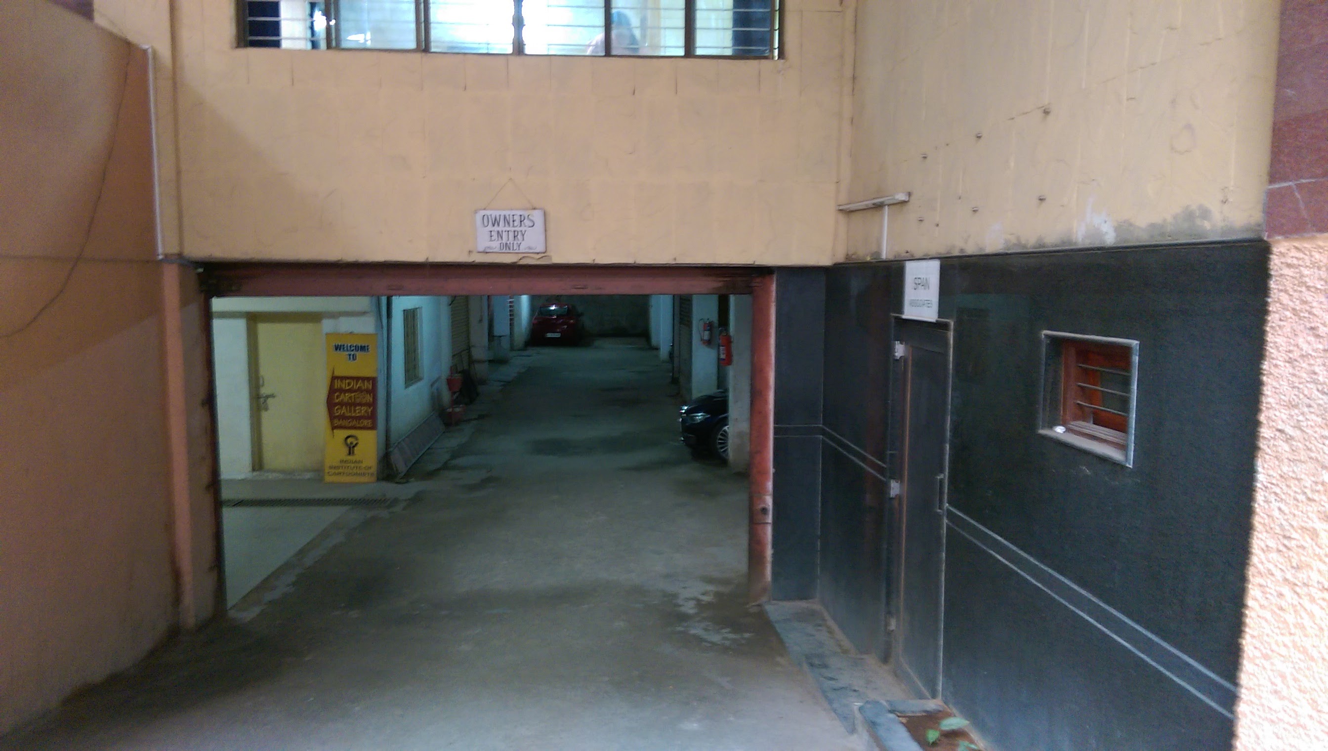
His words had a sting to them as the Cartoon Exhibition he was referring to was one featuring the works of Mario Miranda, and his sketches of Karnataka no less. The exhibition was held at the Indian Cartoon Gallery at Midford House, off MG Road.
From the 6 to the 27 of August, the gallery would play host to a selection of Miranda’s sketches, originally produced for The Open Eyes, a 1975 book on Karnataka by Dom Moraes. The book was commissioned by the Information Department of the Government of Karnataka.

The gallery shares its entrance with the building’s basement parking, which has an ominous sign overhead that reads “Owners Entry Only”.
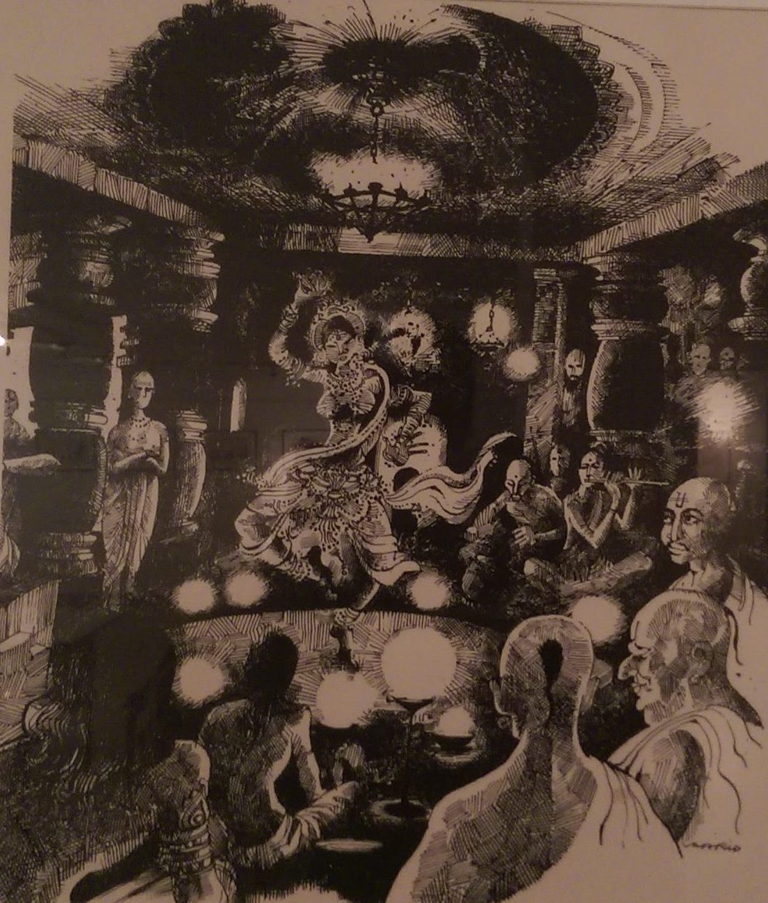
On entering the gallery, the eye is immediately drawn to the first frame to the left of the entrance, simply because there is so much going on in it.

The sketch radiates out from the center of the page where we see a dancing woman adorned in jewelry. Around her sit a crowd of Brahmin men who watch her intently. At the far end are two musicians and across from them is the only person in the sketch who doesn’t seem to be having a good time. He stands by himself at the edge of the frame with his arms crossed. Little orbs of light surround the dancer, which leaves the rest of the scene in partial darkness. All these variations in shade are achieved with Miranda’s signature crosshatching.
A majority of the sketches captures the sprawling landscapes of Karnataka in a moment of tranquility. One shows us a quaint coastal hut framed by coconut trees with a pair of boats nearby. His landscapes usually occupy one corner of the frame with most of the details while trailing off softly towards the other, blending the image and medium together and leaving much to the viewer’s imagination.
The gallery was lit from above by a multitude of little lamps that are supposed to be aimed at the works on display but instead look around in random directions, like school children when asked about their homework. This resulted in some of the sketches being very well lit, while others were left in partial darkness.
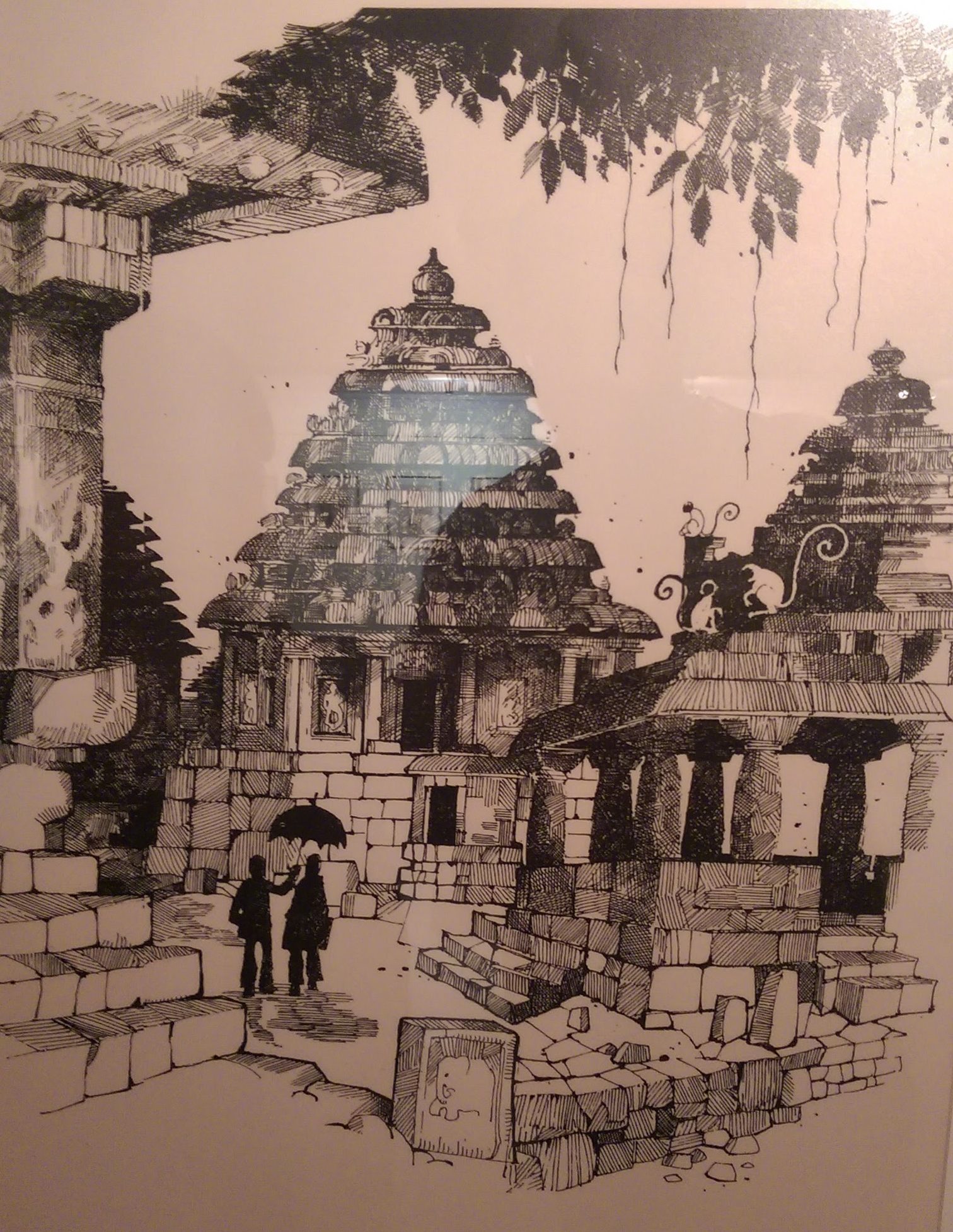
Miranda’s composition draws the eye all the way across the page with enough time to take in all the details he’s painstakingly added. One of the sketches depicts a woman and child walking towards the viewer, carrying baskets on their heads. If you look closely, you see the convoy of people walking across the top of a dam in the background. Another sketch shows us an ancient temple complex, almost in ruins with bits of its once great presence scattered across the ground. The level of shading and detail by itself is all consuming, but in the center of the page is something that puts the entire thing in perspective.
 We see the silhouettes of two people standing amidst the various dilapidated buildings, with their shadows trailing off behind them. The shapes are too vague to tell for sure but there is enough to assume that they are a man and a woman, possibly a couple out on holiday. The man holds up an umbrella in defiance of the sun, but he holds it over the woman’s head. She seems to ignore the gesture altogether, looking away in the other direction. You can deduce that they fought the previous night and now the man extends the umbrella out as an olive branch, hoping to make the rest of their holiday better. These are details that the sketch could technically do without, since it is the landscape that’s important. But their addition helps tell a story, making the art of illustration less mechanical.
‘Which temple was this?’ you might ask. A very good question.
The sketches were displayed shorn of context, and hence each was accompanied by questions like “Where is this?”, “Is this place really in Karnataka?” and “Who exactly is this person I’m looking at?”. Seeking help at the gallery was an exercise in futility. The only other people in the gallery were conversing in loud voices in some back room, while watching Titanic. The conversation was occasionally broken when something interesting happened on screen, like when Rose tells Jack she’ll never let him go, only to carry on with the same fervour a moment later.
These dilapidated buildings benefit the most from Miranda’s style, as it lends itself well to giving us differences in texture and shade. The best example of this can be seen in the middle of the gallery in a sketch that depicts an old colonial house from its courtyard. The walls can barely hold their own weight and have thus elected to shed whatever isn’t necessary. To this end, the paint on the walls only exists in uneven patches, like depictions of crisp new continents. The walls have gaping holes in them and corners of archways have eroded into nothingness. Miranda gives us all these details with his crosshatching, leaving places where the paint remains free of shading while the edges of crumbling walls have overlapping lines giving them depth.
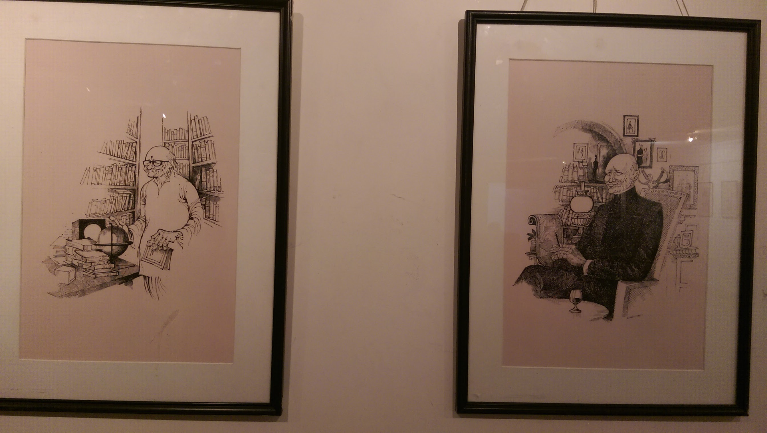
This level of detail extends indoors as well, as we see from the few portraits on display. Most were of older men who had a politic air about them. They sat in the center of the page, dressed in their Nehru jackets, framed in a study full of books and pictures with elaborate frames around them. The shading on their clothes make it seem like you could reach out and feel the texture of it. The lines of Miranda’s intricate shading meet at random points, leaving dark dots throughout their clothes that look like balls of lint.

The most interesting pieces at the exhibition were what one can assume are a set of related sketches that echo each other in composition and tell a story together. One portrays a long haired boy perched below a sprawling tree, covering one side of the frame with his Mowgli-ness. The image trails off in the style that Miranda is so fond of with a deer drinking from a lake and finally to a tiger, who has his eyes on the boy, hiding at the far right.
The other sketch has a boy perched on a tree as its focal point as well but what surrounds him is anything but similar. Tall buildings with signs that read “Syndicate Bank’, ‘Yezdi’ and ‘Hospital’ tower around. The image trails away again into depictions of buildings under construction and finally terminate in much the same way with a scene of factories spewing smoke into the air and effluents into the water.
These two pieces are tragically separated and placed at two ends of the gallery. The only real logic that could be derived from their placement was one that the gallery shares with P.T teachers across the city – height order.
It would have benefitted greatly from the addition of an information card below each sketch saying something about the piece. With the exhibition being portrayed as ” Karnataka as seen by Mario”, it seemed like a no brainer to tell us what exactly Mario was looking at.
Since there wasn’t a soul in sight to talk to, the guest book placed at the entrance shed some light on the reception of the exhibition. It revealed that there were others who felt that this exhibition wasn’t getting the foot traffic it deserved. A patron by the name of K A Padmanabha writes about how he thinks this exhibition would have benefited from being held at Chitra Kala Parishad, while Sanjay Kake is simply grateful for having the opportunity to experience Miranda’s work on display, praising the level of detail in each piece.
The last entry in the book seems to have summed up the exhibition in the best possible way. Tarun T simply wrote the word ‘Amazing’ and underlined it.
Kevin Mathews
Latest posts by Kevin Mathews (see all)
- A Pulao I Once Knew - 6th March 2017
- Which way to the bathroom? - 20th September 2016
- When Mario Miranda came to our Verandah - 2nd September 2016


